Cool grey ran the exterior palette for the better part of a decade. Slate-blue siding, charcoal trim, and white-washed stone gave whole subdivisions the same flat, photographic look. That era is closing. The stone cladding color trends for 2026 pull decisively toward warm earth tones, and the shift is showing up in commercial facade specifications, distributor sell-through, and the quarry blocks buyers actually request. For anyone stocking or specifying natural stone by the container, this is not a decorating story. It is an inventory decision with a production clock attached, made months before the container loads.
This guide breaks down the five color families gaining share and the mineralogy behind them. It tracks how preferences split across North America, Europe, the Middle East, and Oceania, then shows how a distributor stocks the shift without holding cool-grey pallets that no longer move. Every claim about consistency, format, and origin traces to a single-quarry manufacturing process, not to a paint chip.
- The 2026 facade palette moves from cool grey toward warm earth tones, biophilic greens, and refined mineral finishes, with terracotta among the fastest-rising exterior colors.
- Five stone color families are gaining share: warm grey or greige, terracotta and copper, sand and beige, mineral white, and multicolor slate.
- Color in natural stone comes from mineralogy, hematite for reds, limonite and goethite for yellows and browns, and it is UV-stable, so it does not fade like pigment.
- Batch-Specific Vein Selection holds 95%+ color-transition consistency across a single order, the number that separates a quarry source from a color lottery.
- White quartzite and the 36x10cm mini ledgestone format lead European minimalist demand, while warm grey and sand-beige stay the volume anchors.
Why Cool Grey Is Losing Ground
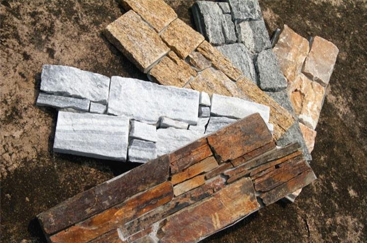
The turn is measurable, not anecdotal. Commercial facade forecasts for 2026 describe a palette built on warm earth tones, biophilic greens, and refined mineral finishes. It is a clear move away from cool grey, a direction cladding and coating manufacturers now publish in their 2026 color guidance. Terracotta is called out among the fastest-rising exterior colors of the year. The biophilic design movement pulls it up, tying buildings to natural, lived-in material. The same guidance names warm stone, sand, and mineral neutrals as the volume base. Warm neutrals and deep earthy tones now dominate the direction, replacing the stark white-and-grey combinations that peaked in the early 2020s.
Why does this matter to a stone buyer rather than a paint buyer? Because cool grey was easy to render and easy to photograph, and it flattened everything it touched. Warm mineral tones do the opposite: they carry natural variation, catch light differently across a split face, and age without looking tired. A facade that reads as “warm grey to terracotta” photographs with depth and does not date the way a monochrome charcoal elevation does within three years.
There is a durability argument underneath the aesthetics. Pigmented coatings chase trend colors by changing the paint, and the color sits on the surface where UV and weather attack it. Natural stone carries its color inside the mineral matrix. Slate and quartzite cladding is UV-stable and rated through -30C to +50C thermal cycling, so the tone approved at sample stage stays inside the stone rather than on a painted film. That is a specification a facade consultant can defend without a maintenance clause.
The Warm Grey to Terracotta Spectrum
Stone color is chemistry before it is marketing. Reds and rusts come from hematite, an iron oxide that stains the stone from within, the same mineral color chemistry documented in the geological record. Yellows, tans, and browns come from limonite and goethite, hydrated iron oxides that produce the softer earth end of the spectrum. Greens carry chlorite or serpentine. Whites are low-iron quartzite or calcite with little metallic staining. Grey is the middle ground, and the difference between a “cool” grey and a “warm” grey is how much iron oxide is present and whether it leans blue or brown.
This is why two panels labeled “grey” from different quarries can look like they belong to different buildings. One is a blue-toned slate with minimal iron; the other is a greige quartzite carrying enough limonite to read warm in afternoon sun. A distributor who understands the mineral basis can predict how a color behaves under a market’s light. That same knowledge explains to a specifier why a “warm grey” holds its tone better than a dyed or resin-finished substitute.
| Color Family | Mineral Driver | Reads As | 2026 Direction |
|---|---|---|---|
| Warm grey / greige | Low iron with limonite tint | Soft, grounded neutral | Rising, replaces cool grey |
| Terracotta / copper | Hematite iron oxide | Warm red to rust | Fastest rising exterior tone |
| Sand / beige | Goethite, calcite matrix | Desert, coastal warmth | Steady, broad appeal |
| Mineral white | Low-iron quartzite | Clean, minimalist | Strong in European modern |
| Multicolor slate | Mixed oxides, chlorite | Layered, natural variation | Growing for feature walls |
Five Color Families Gaining Share
Trends are useful only if you can put a panel on a pallet. These five families are where the 2026 demand concentrates, and each maps to a format and a buyer. The through-line is warmth and mineral variation over flat, cool uniformity.
Warm Grey and Greige
Warm grey is the bridge color for buyers who are not ready to commit to terracotta. It carries enough brown or mineral undertone to feel current without reading as a bold statement, which makes it the safest large-volume specifier choice for 2026. A greige quartzite in the 15x60cm ledger format covers a residential or light-commercial elevation without the cold cast that dated the last decade. This is the color to hold the most square meterage of, because it moves across the widest range of projects.
Terracotta and Copper
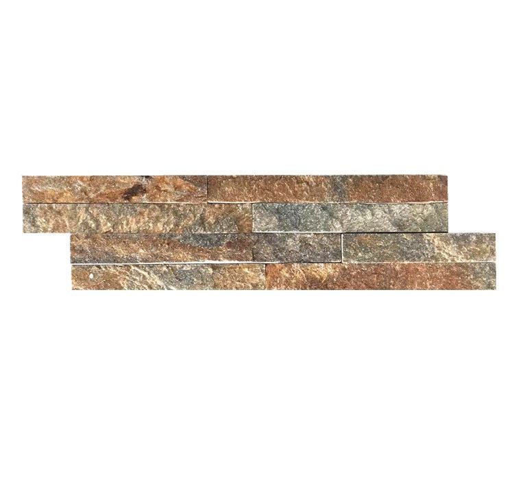
This is the family with the momentum. Hematite-driven copper and rust tones answer the biophilic pull directly, and they photograph with a warmth that cool grey never delivered. For a distributor, terracotta is the higher-margin, higher-attention color: it wins design-forward residential and hospitality projects where the specifier wants the building to feel grounded and hand-made. Stock it in split-face and stacked formats where the iron oxide variation shows across the face.
Sand, Beige, and Earth Tones
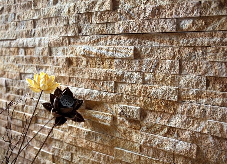
Sand and beige are the workhorses of warm, coastal, and desert markets. They read as timeless rather than trendy, which makes them low-risk inventory that does not age out of a catalog. A beige-yellow linear loose stone suits Mediterranean, Middle Eastern, and Australian coastal projects where the light is hard and a cool grey would glare. This family is your volume anchor alongside warm grey.
Mineral White
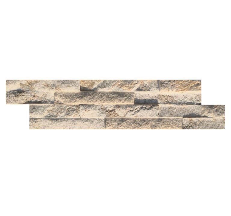
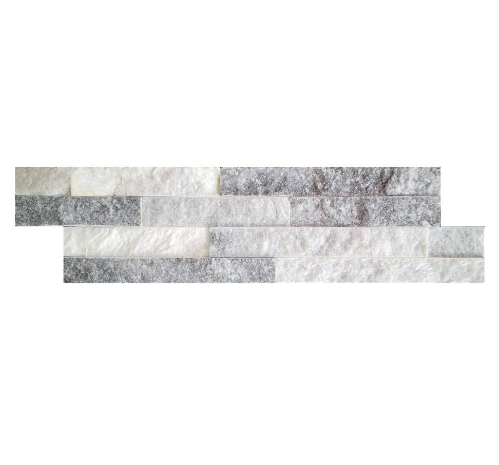
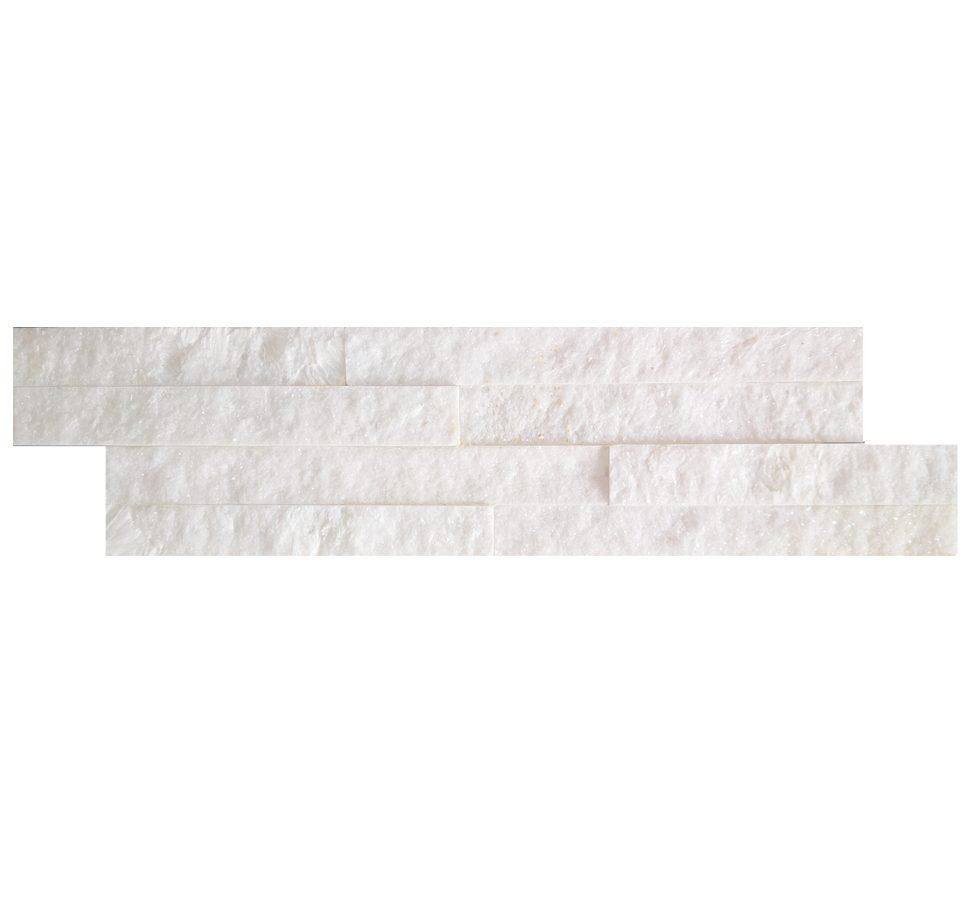
White quartzite is the premium minimalist play, and it is strongest in European modern architecture where clean lines and light interiors dominate. It is not the stark, blinding white of the early 2020s; it is a soft mineral white with faint natural veining that keeps a wall from feeling clinical. Because it shows every inconsistency, white is the color that most rewards single-vein sourcing. The ultra-thin ledgestone panel range carries the white quartzite in the 36x10cm format European buyers specify for linear, low-weight interiors.
Multicolor Slate
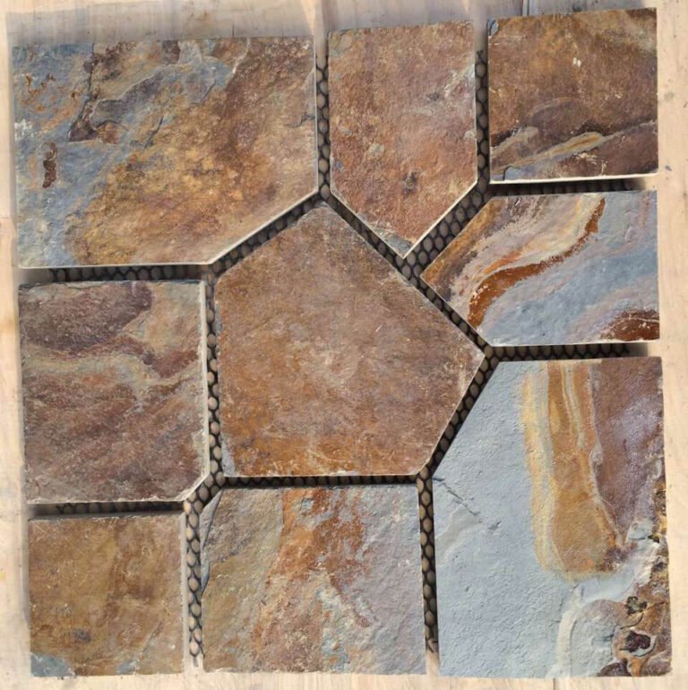
Multicolor slate is the variation-forward choice for feature walls and projects that want visible natural movement. Blended oxides and chlorite give panels that shift tone across a single face, which reads as authentic masonry rather than manufactured uniformity. It is a strong interior and outdoor accent and pairs well with the warm grey and terracotta families on a mixed elevation.
Regional Color Preferences by Market
Color does not travel. The stone cladding color trends of 2026 are global in direction but regional in execution, and a distributor who stocks one palette for every market will over-order in some and stock out in others. North America leans warm and earthy on residential exteriors, with terracotta and sand moving into design-forward housing. Europe runs minimalist and light, favoring mineral white and fine linear formats in the 36x10cm mini ledgestone profile. The Middle East and coastal Australia favor sand, beige, and warm neutrals that handle hard light and heat. These preferences trace directly to the factory’s main export markets across North America, Europe, Oceania, the GCC, and Southeast Asia.
| Market | Leading Colors | Preferred Format |
|---|---|---|
| North America | Warm grey, terracotta, sand | 15x60cm stacked ledger panels |
| Europe | Mineral white, fine grey | 36x10cm ultra-thin mini ledgestone |
| Middle East / GCC | Sand, beige, warm neutral | Cement-backed Z-panels, stacked stone |
| Australia / NZ | Beige, coastal warm tones | Flagstone, split-face panels |
A practical read: if you serve more than one of these markets, do not average the palette. Split the container by market and let the format follow the color. The European buyer who wants mineral white almost always wants the thin, light 36x10cm profile that maximizes square meterage per 20GP. The North American residential buyer wants the heavier 15x60cm ledger board.
How Distributors Should Stock Colors
Stocking a trend is a bet with a production lead time attached. Samples come back in 1 to 3 working days, and stock production runs about 20 working days. A first order with custom printed cartons takes 25 to 30 working days, all against a one-20GP-container minimum. That clock is the reason to act on the color shift now rather than at the end of the season. A distributor who waits until terracotta is obvious in the market has already lost the first ordering window.
The low-risk structure is a barbell. Anchor the majority of square meterage in the two families that move everywhere, warm grey and sand-beige, because they clear across the widest range of projects and rarely age out of a catalog. Allocate a smaller, higher-margin slice to terracotta and copper, the momentum colors that win design-forward work and command attention in a showroom. Hold mineral white for the European and minimalist-interior demand rather than as a general line, since it is unforgiving of inconsistency and moves in a narrower set of markets.
Two levers reduce the risk of a color bet. The first is Custom Color Mix: on loose thin-veneer orders the factory blends color ratios to a buyer’s target. A distributor serving a specific regional taste can dial the warmth rather than gamble on a stock shade. The second is sampling before committing a full container, which turns a trend forecast into a physical panel you can hold under the light your market actually gets. The broader context for how these colors perform over time is covered in the natural stone facade trend analysis. The full color range across formats sits in the stacked stone wall panel color options guide.
Keeping Color Consistent Across Orders
Here is the part that separates a quarry source from a broker: color consistency at volume. Natural stone varies, and a buyer who orders 300 square meters of “warm grey” and receives three visible shades has a patchy wall and a claim. The control is Batch-Specific Vein Selection, which locks the whole shipment to a single quarry vein and hand-sorts the panels so color transition stays coordinated. The result is 95%+ color-transition consistency across an order, the number that lets a specifier promise a client one continuous tone across an entire elevation.
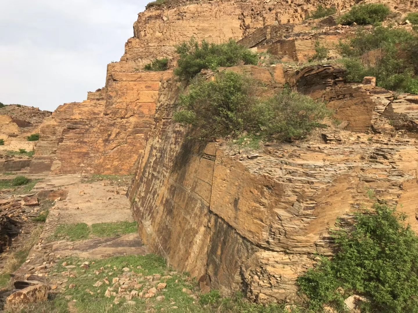
Consistency is also why the trendy colors are safer than they look. Terracotta and multicolor slate carry natural variation by design, so slight panel-to-panel movement reads as character. Mineral white does not have that cover, which is why white orders benefit most from single-vein sourcing and a pre-shipment layout photo. The factory provides a high-resolution layout of the actual production run before the balance payment, so a buyer sees the color on the wall before it ships. The mechanics behind that control are detailed in the batch color consistency and quarry vein selection breakdown.
Stone Color Trends Questions Answered
What stone cladding colors are trending in 2026?
Warm grey or greige, terracotta and copper, sand and beige, mineral white, and multicolor slate. The direction is a clear move away from the cool grey-and-white palettes that peaked in the early 2020s toward warm, mineral earth tones driven by biophilic design.
Is grey stone cladding going out of style?
Cool blue-grey is fading, but warm grey with brown or mineral undertones is not. Greige remains one of the safest large-volume specifier choices for 2026 because it reads as current without committing to a bold statement color.
Which stone color hides variation best on a large facade?
Multicolor slate and terracotta hide natural variation best because their iron-oxide movement reads as intended character. Mineral white shows every inconsistency, so white orders depend most on single-vein sourcing and a pre-shipment layout photo.
How do I keep stone color consistent across a big order?
Source the entire order from one quarry vein with hand sorting. Batch-Specific Vein Selection holds 95%+ color-transition consistency panel to panel, and a pre-shipment layout photo lets you approve the actual run before the balance is due.
Do natural stone facade colors fade in sunlight?
No. Slate and quartzite carry their color inside the mineral matrix and are UV-stable, rated through -30C to +50C thermal cycling. Pigmented paints and stains sit on the surface and chalk or fade, which is why stone holds its tone for decades.
Can I match a specific stone color for my market?
Yes. On loose thin-veneer orders the factory supports Custom Color Mix ratios, blending shades to a buyer’s regional target. Send a physical sample or a design reference and the lab matches the vein, cutting tolerance, and backing in a 1:1 sample.
Conclusion
The stone cladding color trends of 2026 amount to a rotation from cool grey to warm earth. For a distributor that is a stocking decision with a production clock attached, not a decorating whim. The buyers who read the shift early order terracotta and warm grey before the trend is obvious at retail. They protect the margin by sourcing color from a single quarry vein rather than a blended lot.
Key takeaways:
- Stock the barbell: warm grey and sand-beige as volume anchors, terracotta and copper as the higher-margin momentum colors.
- Match format to market, mineral white and the 36x10cm mini ledgestone for European minimalism, 15x60cm ledger boards for North American residential.
- Insist on Batch-Specific Vein Selection and a pre-shipment layout photo; 95%+ color consistency is what prevents a patchy elevation.
- Treat a below-market trend color with no stated quarry vein as a red flag for blended, inconsistent stock.
Ready to build a 2026 color program around a single quarry source? Send your target market and color reference to Top Stone Panels. The export team will return a Custom Color Mix recommendation, a 1:1 sample in 1 to 3 working days, and FOB terms from Tianjin Xingang against a one-container minimum.