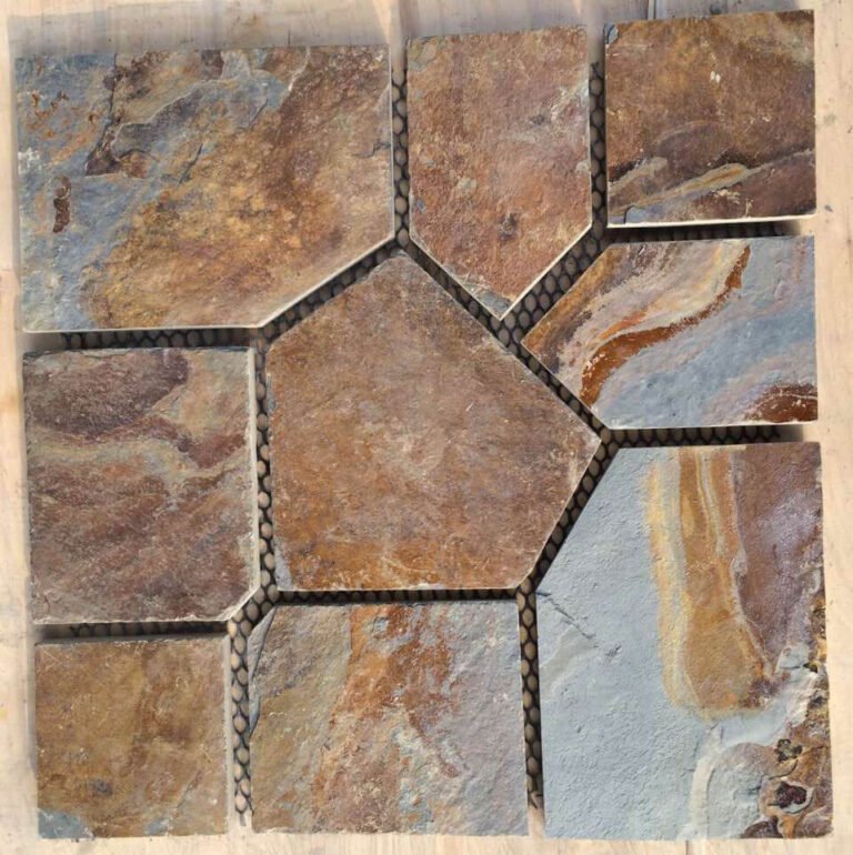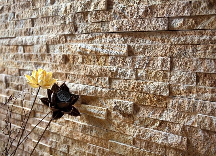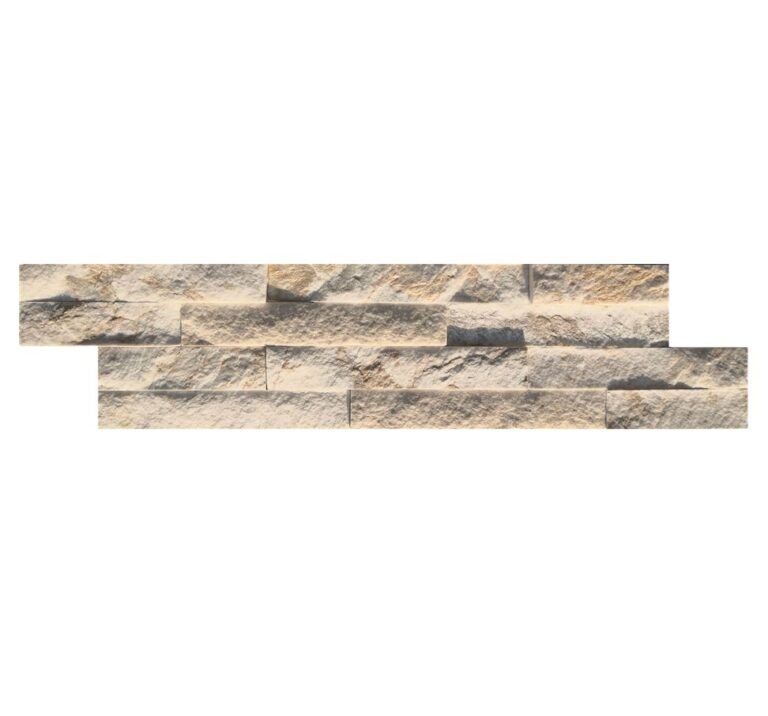
Grey photographs cold. White photographs clinical. A beige or crema stone panel sits in the awkward middle that commercial buyers keep coming back to once a project has to look welcoming on a Monday morning and still look current in four years. The problem is that “beige” is not one thing. It is a band that several different materials fall into, each aging, cutting and shipping differently, and a distributor who specifies the word without specifying the material is the one who gets the call when a facade comes in pink.
This guide treats the warm-neutral band as a buying decision. It covers where a beige tone actually comes from in stone, which of the six material lines deliver it, why commercial specifiers reach for it, how a distributor keeps one neutral tone consistent across a phased build, and how format and freight change the answer once the colour is agreed. It is deliberately not a repeat of the palette-specific guides already on this site; those are linked where a tone needs contrast, not restating.
- Beige and crema are a tone band delivered by several materials (beige quartzite, warm sandstone, cream limestone, mixed split-face), not a single stone or a colour code.
- For commercial spaces the value is in the middle: warmer than grey, softer than white, which photographs well under both facade and interior lighting and resists trend cycles.
- Tone consistency across a phased build is a vein-and-sample discipline, not a luck. Lock an approved sample and order by phase against it.
- The 95 percent transition-consistency figure belongs to split-face loose stone sorted to one vein; panelled and glued formats are matched to the retained approval sample instead.
- Format is a commercial decision as much as an aesthetic one: thin ledgestone stretches freight on big facades, interlocking cement-backed panels speed a plane, and factory corners cut site labour.
- Specify the material, not the word “beige”, or you will not control fade, density or how the tone lands on site.
- What “Beige” Actually Means in Stone
- Where the Tone Comes From, Material by Material
- Why Commercial Specifiers Pick the Warm Neutral
- The Consistency Problem at Commercial Scale
- Beige Against the Rest of the Palette
- Format and Freight Decide the Rest
- Stocking Beige Stone Panels for Commercial Projects
- What to Ask Before You Order a Beige Batch
- Frequently Asked Questions
- Conclusion
What “Beige” Actually Means in Stone
In tile, laminate and paint, beige is a code. You name it, you order it, you get it. Natural stone does not work that way. Beige is not a formula a factory mixes; it is the description a buyer puts on a family of stones that happen to fall between cream and light tan, warm but not orange, neutral but not grey. Two “beige” walls can be entirely different rock. One might be a beige quartzite, dense and mineral-stable, another a warm sandstone with visible bedding, another a cream limestone that reads almost chalky in low light, and a fourth a mixed split-face veneer where beige is the average of a band that still runs cream to tan stone by stone.
That difference is not cosmetic, and it is where commercial projects get hurt. Density, water behaviour, how the edge breaks when split, how the tone sits after twenty wet-dry cycles, and how heavy the finished panel is all follow from the material, not from the shared colour word. A specifier who writes “beige stone cladding” on a drawing has described a look and said nothing about performance. A distributor who reads that drawing and ships the cheapest material wearing that colour owns the argument when the facade does not behave. The discipline that protects a beige wall is the same one that protects any stone wall, covered in the exterior cladding specification guide: name the material, then the tone.
Where the Tone Comes From, Material by Material
At Top Stone Panels the warm-neutral band is sourced from the quarry as blocks, not blended as pigment, and the tone travels through several of the six lines. The most mineral-stable expression is beige quartzite: hard, fine-grained, and held as large rough blocks before it is cut, which is why a beige quartzite panel keeps its colour across a facade rather than shifting panel to panel. The quartzite line is profiled in quartzite stone panels and ships under HS code 6802.93.11.
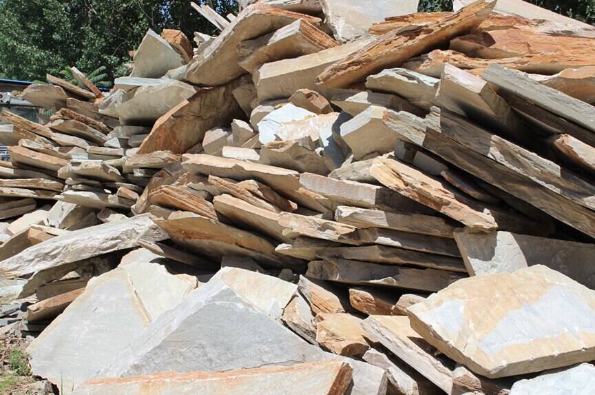
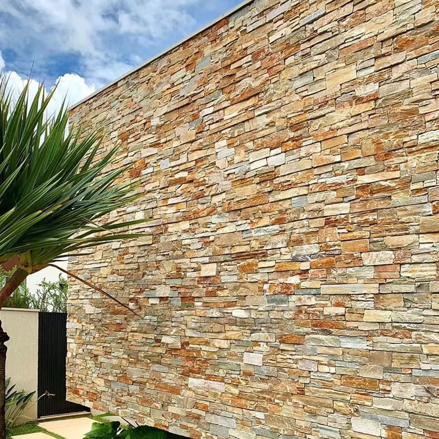
Warm sandstone sits at the softer end of the same band: a beige that shows its bedding and reads tactile up close, best where a project wants warmth and texture rather than a clean plane. The trade-offs against limestone are worked through in sandstone versus limestone cladding and the warm-tone treatment in sandstone veneer warm tones. Cream limestone, in the limestone veneer line, gives the palest end of beige: close to a warm white, quiet, and forgiving in a modern interior or a light facade. Mixed split-face veneer is different again, where the beige you see on the finished wall is the average of a hand-sorted band running cream through tan, which is exactly what keeps a large natural wall from flattening out.
| Material | Where it sits in the beige band | Best commercial fit | Top line |
|---|---|---|---|
| Beige quartzite | Dense, mineral-stable, holds across a plane | High-traffic facades, exterior where fade is a question | Quartzite / veneer |
| Warm sandstone | Softer, shows bedding, tactile | Feature walls, hospitality interiors, close-up reads | Loose stone veneer |
| Cream limestone | Palest beige, warm-white | Modern lobbies, minimal retail, bright interiors | Stone cladding / veneer |
| Mixed split-face | Beige as the average of a cream-to-tan band | Large natural facades that need depth, not flatness | Stacked stone / ledgestone |
Why Commercial Specifiers Pick the Warm Neutral
Commercial interiors and facades are lit, photographed and lived in, and a beige or crema surface behaves well under all three. Under warm downlights it deepens and reads inviting; under cool daylight it stays neutral rather than washing out. Grey tends to go flat or institutional when the lighting is wrong, and pure white goes hard and shows every scuff and grout line. The warm neutral occupies the range that keeps a lobby or a storefront looking intentional without demanding a single exact lighting condition to hold that impression. That is the whole commercial argument for it, and it is a risk-management argument as much as an aesthetic one.
The second reason is a trend cycle. A retail, hospitality or office fit-out gets judged against its neighbours for years, and a neutral beige ages more slowly than a saturated tone or a high-contrast scheme. This is why the palette keeps recurring in commercial lobby designs and commercial feature-wall designs even as accent colours rotate: the beige plane stays, the furniture changes. The Natural Stone Institute frames durability of appearance as part of stone selection, and material stability is precisely what makes a quiet tone safe to specify on a building that cannot be re-clad every few years, as covered by NSI stone-selection guidance.
There is a brand angle too. A distributor stocking a warm neutral can hold one SKU across several end uses, because beige reads correctly on a corporate facade, a boutique interior and a residential developer’s feature wall without fighting any of them. A saturated or ultra-cool tone locks the buyer into one context. The economics of that are part of the distributor partnership and margin model.
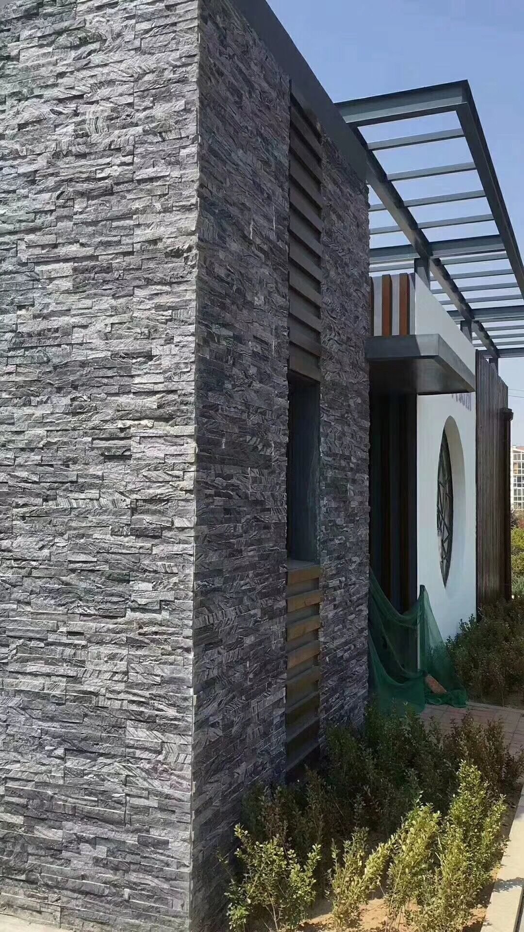
The Consistency Problem at Commercial Scale
A single residential wall forgives tonal variation. A commercial project does not, because a beige facade is rarely bought in one order. It is specified on a drawing, sampled, awarded, then shipped by phase as the building is built and the finance releases in tranches. By the time the second and third containers leave, a natural product can have drifted to a different vein and the “same” beige now arrives visibly different against the first phase already on the wall. This is the failure that ends in a photo of a facade that looks patched, and it is a supply-chain problem, not a stone problem.
The control is a retained physical reference. Before any production beige is approved, the buyer and the factory agree on an actual sample, and that sample, not a colour chip or a screenshot, is what every later batch is matched against. For split-face loose stone the factory can go further and sort to a single vein, and Top’s loose-stone discipline holds those natural transitions at 95 percent or better, which is scoped to split-face loose stone only; bonded panels and ledgers are matched to the retained approval sample rather than described by that same figure. The mechanism behind it, why a vein and a hand-sort are the real levers, is set out in batch colour consistency and quarry vein selection.
Where a project needs a beige that is not a standard stock tone, the mix can be built to a specified ratio in the custom colour-mix and OEM process, so the target neutral is a locked recipe held on file rather than a best-effort guess each order. Either way, the buyer’s job is to keep one sample, one reference number and one vein definition across the phases, and to raise a purchase specification that carries them, which is the point of the purchase-specification template.
Beige Against the Rest of the Palette
Beige is easiest to specify once you know what it is refusing to be. Against grey it trades a cool, modern, sometimes hard read for warmth: the cool side of the palette is handled in the grey stone veneer colour guide, and if a project wants restraint over warmth, grey is the answer, not beige. Against white it trades brightness for body: white stone panels on a facade go luminous and clean but demand care around grout lines and light spill, where the cream end of beige does most of the same work with less exposure.
Against the deeper warm tones it trades drama for longevity. The saturated end of the family lives in gold and brown warm facade tones, which are striking on a single feature wall but heavy across a whole commercial plane; beige carries warmth at a scale a facade can tolerate. Where the decision is genuinely between a bright neutral and a warm neutral, or between beige and black, the wider palette reads across stone cladding colour trends and the option of combining tones on one wall is worked through in mixing stone colours for wall variation. The point of linking them is that beige is a position on a spectrum, and choosing it is choosing where to land relative to the neighbours.
Format and Freight Decide the Rest
Agree the tone and the format question starts, and on a commercial job format is a freight and labour calculation wearing a design question. A big beige facade is bought by the square metre delivered, so weight per square metre drives landed cost more than the colour does. The ultra-thin mini ledgestone line at 36×10 cm exists for exactly this: a lighter panel and a tighter packing profile mean more real cover per container, which on a long-run facade is the difference between one freight charge and two. That freight logic is quantified in the panel weight calculator and the 20GP versus 40HQ loading comparison.
On the build side, a large plane rewards interlocking geometry. The cement-backed interlocking Z-panel system in 20×55 cm and 15.2×61 cm self-aligns and buries the vertical seam, so a broad beige wall goes up as one surface instead of a visible grid, and the male-female edge carries straight lines the crew would otherwise cut. At the outside corner, factory L-corner sets take the 45-degree miter off the highest-risk line on the building and save roughly 20 percent material waste and over 50 percent corner labour, which on a commercial facade with many returns is real money, detailed in the L-corner pieces guide. Standard bonded ledgers in 15×60 cm and 15×55 cm remain the default bulk consumable for distributors who stock beige as a fast mover across the stacked stone and thin stone veneer lines.
Stocking Beige Stone Panels for Commercial Projects
For a distributor, beige is a stocking decision before it is a design one. A warm neutral is the tone most likely to serve three or four unrelated customers from one pallet, so it earns a place in the range a saturated accent does not. The question is how much and in which formats. Minimum order and container mix are the levers: a first beige range is usually a spread across materials and formats in a mixed container rather than one deep SKU, and the MOQ and mixed-container ordering guide covers how to hold coverage without over-committing to a tone you have not yet sold twice.
Private-label matters more on a neutral than on a novelty, because a beige range is the one a downstream builder learns to reorder by name. Holding the OEM colour-mix definition and the packaging artwork on file means a repeat order does not carry a second setup charge, which is the practical trust signal in the private-label and branding guide. The full range decision, tone and format together, sits in the complete stone panel buying guide.
What to Ask Before You Order a Beige Batch
Most beige problems are preventable in the sample stage. The checklist below is what a distributor or specifier should settle with a supplier before a beige batch is committed to a commercial drawing, and the sample process behind it is set out in how to order stone samples and the sample evaluation checklist.
- Name the material, not the colour: beige quartzite, warm sandstone, cream limestone or a mixed split-face, so density and behaviour are on the order.
- Agree one retained physical sample per tone, kept by both sides, and reference it on every later container.
- Ask which vein or mix the batch is drawn from and whether split-face is sorted to that vein.
- Confirm the format for the plane and the corner strategy: interlocking geometry for large faces, factory L-corners at the returns.
- Check landed weight per square metre and the container size, because format and freight, not colour, set the true cost.
- For a phased build, put the sample reference and vein definition into a written purchase specification before production starts.
Frequently Asked Questions
Are beige stone panels only for warm or rustic buildings?
No. Beige and crema read as warm-neutral, so they work on modern commercial facades and lobbies as well as traditional ones; the tone settles between grey and white rather than pulling rustic.
Where does a beige stone tone actually come from?
From the material: beige quartzite, warm sandstone, cream limestone and hand-sorted split-face mixes all sit in that band. It is a mineral and vein property, not a surface stain.
How do I keep one beige tone across a multi-phase commercial build?
Lock the vein and the mix on an approved physical sample, order by phase against that reference, and have the supplier sort to that batch. Split-face loose stone can be held to 95 percent transition consistency; panelled formats are matched against the approved sample.
Does beige fade on an exterior facade?
A stable mineral tone in slate or quartzite holds; the fade risk is a cheap dyed or coated product, not a genuine beige stone. Specifying material, not colour, is the control.
What beige format suits a large commercial facade?
Weight and freight drive it: ultra-thin 36×10 cm ledgestone stretches metres per container, cement-backed interlocking panels speed a big plane, and factory corners cut site labour.
Conclusion
Beige and crema stone panels earn their place in commercial work because they are the least demanding tone on the palette to live with: warmer than grey, softer than white, stable enough to survive a lighting change and a trend cycle without looking wrong. The buying discipline is that “beige” names a look, not a product. Specify the material, lock one physical sample across the phases, sort the loose stone to a vein or define the mix, choose the format for the plane and the freight, and put factory corners on the returns. Do that and a warm neutral is the most predictable stone you can stock.
- Name the material behind the beige: quartzite, sandstone, cream limestone or mixed split-face.
- Retain one physical sample per tone and match every later container to it, not to a screen.
- Hold split-face to a vein, or lock a custom mix on file, for multi-phase consistency.
- Pick the format for landed weight and site speed, then add factory L-corners at the returns.
- Stock beige as the range that serves several customers, in a mixed first container before you go deep.
Specifying a warm neutral for a commercial facade or lobby and worried about tone drift across phases? Send the drawing and target tone to the Top Stone Panels team and we will match the material, lock an approved sample and set the format for your freight before production starts.